Northland Investments Rebrands
Problem: When I started my six-month employment at Northland Investment Corporation, its 80+ owned residential properties all had the standard grey and orange corporate branding. Limited by the standardized branding, these communities couldn't show their unique personalities.
Solution: Give each apartment community its own unique brand identity based on its architecture, location, and residents to strengthen brand identity, resulting in a streamlined leasing process and improved resident experience.
brand identity work experience
•
brand identity work experience •
A snapshot of the colors, iconography, and imagery is included in each brand kit as a guide for future implementations. Each kit I created was informed by extensive research on the culture and architecture of the area as well as firsthand feedback from onsite employees.
Brand Kits
For some properties like Emblem Alpharetta, the rebranding process included a logo redesign. In the new logo, my main objective was to keep a subtle reminder of the previous emblem symbol while maximizing the readability of the text, as this particular property is a 55+ community.
Logo Redesign
Choosing the right blend of property photos and stock imagery was essential to crafting a unique and appealing brand for each of the 20 property websites I redesigned from scratch.
Website Redesign
Take a scroll through the Homestead Talking Glass site below or view the live site here.
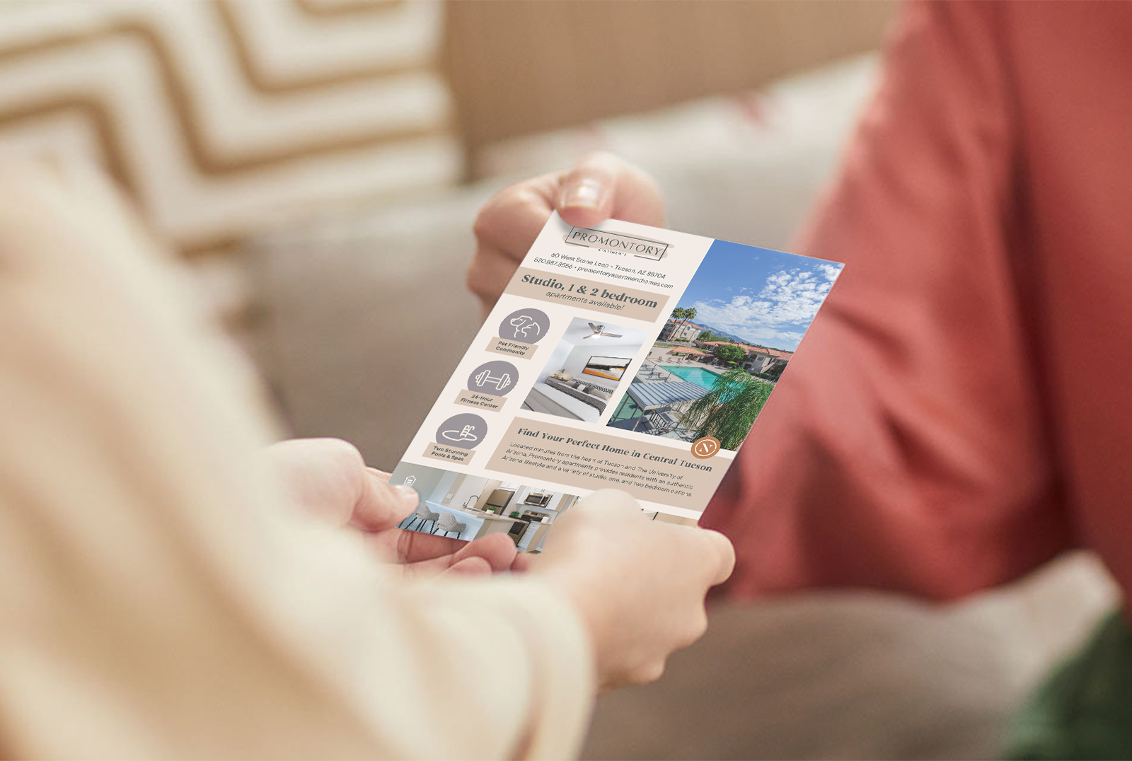
After visiting properties to observe the leasing process, I noticed one critical flaw: no community seemed to have a standardized set of information to give prospective residents.
A one-pager handout quickly became part of my rebrand materials and was rolled out as company-wide collateral.


